
Hello Darling Theme
Thank you for choosing a Hello You Designs Theme to build your site. Don’t forget to submit your site when you are finished and please contact us if you run in to any hiccups along the way. Below are the basics on getting your new theme set up to appear like the demo. Here is a link as well to the demo that you can view for reference.
Design Basics
Below are the fonts and colors that are used throughout the theme.
Fonts
Colors
Light Gold – #f2ecdc
Dark Gold – #cebb84
Charcoal – #333
Various Grays
Blog Featured Image Sizes
It is good practice to always have your Featured Images be the same size. That is to ensure everything looks uniform. With every demo I create the images to be square 1100×1100 or 800×1200. This is a personal preference and you can of course choose to use any size that you would like. Whatever you choose though make sure that it is consistent for the most uniform look.
* Before Proceeding *
Create a backup of your current site. Always keep an untouched copy of your theme stored on your computer. You will also want to keep an updated version of your theme files stored on your computer, in the case that you accidentally make a mistake and need to use that copy to fix it. You can also download a copy in your account area at any time.
Basic Setup
Plugins used in Demo
If you plan on importing the demo content and widget file you will want to download these plugins first before doing that. If you download the demo content first and a plugin is missing that the demo uses, it will fail to import that content.
- Genesis Enews Extended– This is used for the subscribe/newsletter areas.
- Simple Social Icons– This is used for the social media icons in the sidebar.
- Genesis Simple Share– This is used for the social media sharing at the bottom of blog posts.
- Genesis Responsive Slider– This is used for the post slider on the blog page.
- Portfolio Post Type – Provides the custom post type for your portfolio
- WooCommerce– This is used for the ecommerce area of the site. If you aren’t using this feature, don’t install this plugin.
- Genesis Connect for WooCommerce– This is used in conjunction with the WooCommerce plugin to work nicely with Genesis.
- Instagram Feed– This is used to show your latest Instagram feed.
- Testimonial Rotator– Displays your testimonials.
- Regenerate Thumbnails– This is used to recrop your images if all your images are oddly sized.
- Widget Importer & Exporter– This is used to import all the widgets from the demo and helps with setting up the theme for the first time.
First Steps
- Install the Genesis Framework and make sure it’s activated.
- Install the Theme and activate it.
- Install the plugins listed above before proceeding (leave off any you don’t plan to use).
- If you are using Woocommerce be sure to finish the setup, otherwise your content will not show.
- Reset permalinks. Click “Settings” in your admin menu, then permalinks, and save.
- Your theme uses a Widgetized homepage. Go to Settings > Reading > Select Front Page Displays > Your “Latest Posts”
- Delete old Widgets or Widgets that are located in the wrong section now due to activating a new theme (this applies only if you had an active site, not a new install)
- Run the regenerate thumbnails plugin. (tools>regenerate thumbnails)
- Install XML file with demo content (only if you feel you need it).
- Install the Widget demo file (only if you feel you need it), this will set the widgets up just like the homepage.
If you are starting from a new install you should be able to start editing the demo content with your information. If you have an active site and are switching themes, you will need to do some “cleaning up” and re-arranging of the widgets to have your theme display right. Go to Appearance > Widgets and then open each widget area and delete or rearrange the widgets that are in places they shouldn’t be.
Logo or Site Title – 900pxWide by 300px High
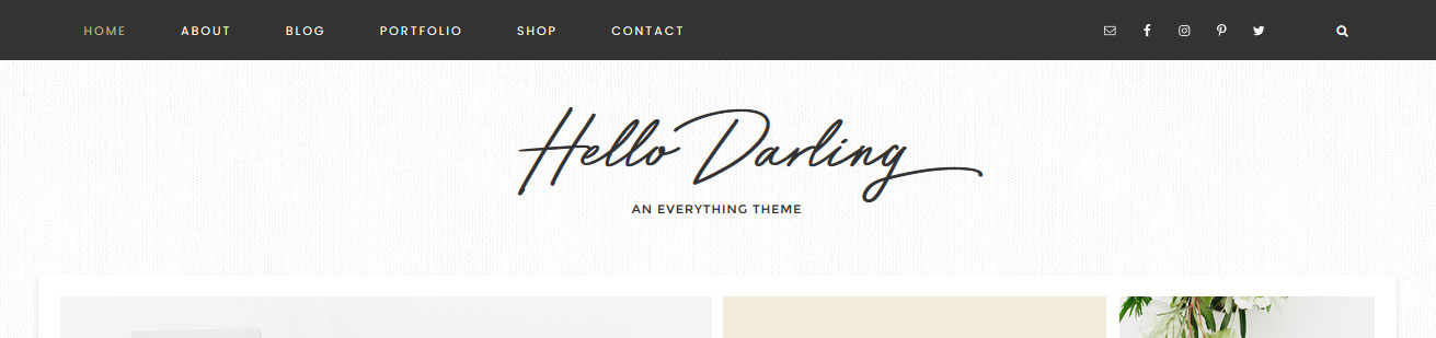 Image – To add a header image, click “Appearance > Header” and you’ll be prompted to upload your logo. Your logo is retina ready and fully responsive, the optimal size is 900x300px. The logo is then compressed to half the original size. This keeps the logo from being fuzzy on mobile devices. The easiest way to properly size the logo is with picmonkey.com or other image editor. Start by creating a canvas the correct size, then place your logo on that canvas and adjust it to fit. Don’t worry about the amount of space on the sides of the canvas, focus more on the height and the logo being centered. For more help on placing your logo on the proper size canvas, visit this tutorial How to upload & Size your LogoText – If you prefer to use text, that will automatically appear. You can set your site name by visiting “Settings > General”
- Place your blog name in the ‘Site Title’ field
- Place your tagline in the ‘Tagline’ field (tagline will not show but is still available for SEO purposes)
Setup your Menus
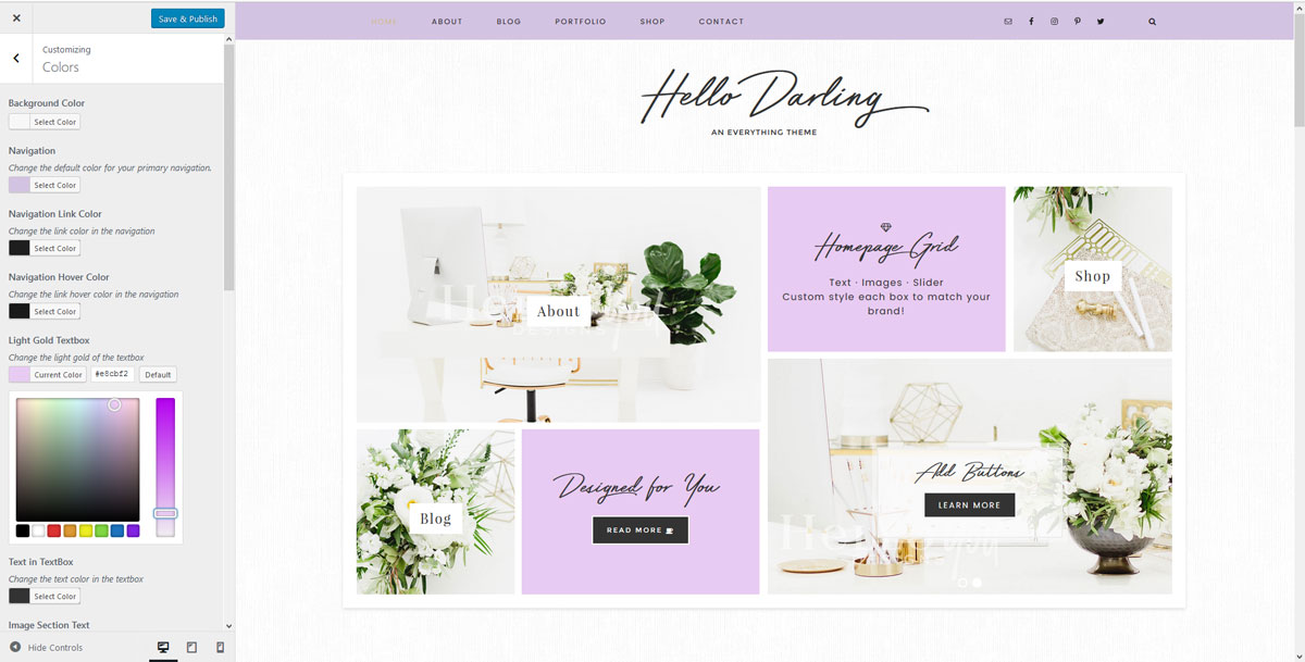
Change Your Colors
Your theme comes with few options to customize the site. If you go to Appearance > Customize you will open the theme “Customizer” screen. There you can change the background and main colors to match your brand. Here is a preview of what that screen will look like.
Change the Background
Hello Darling comes with a custom background option. To change the image go to Appearance > Customize > Background Image. You can load in a pattern, or full image. The ideal size for a full image is 2000×1300, for a repeating pattern that can be any size.
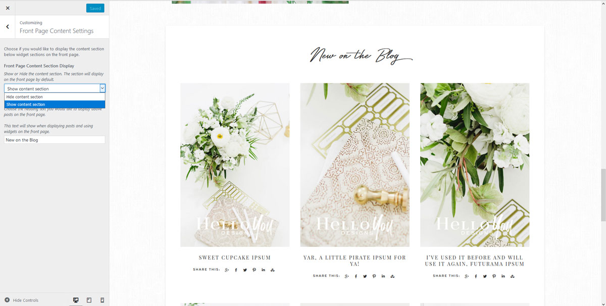
Add or Remove Blog from Homepage
Footer Copyright
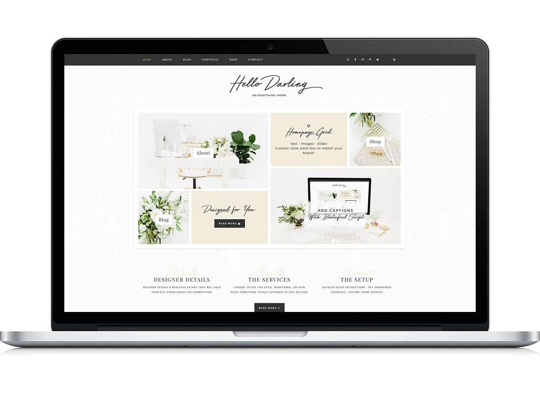
Widgetized Homepage
Widget Areas
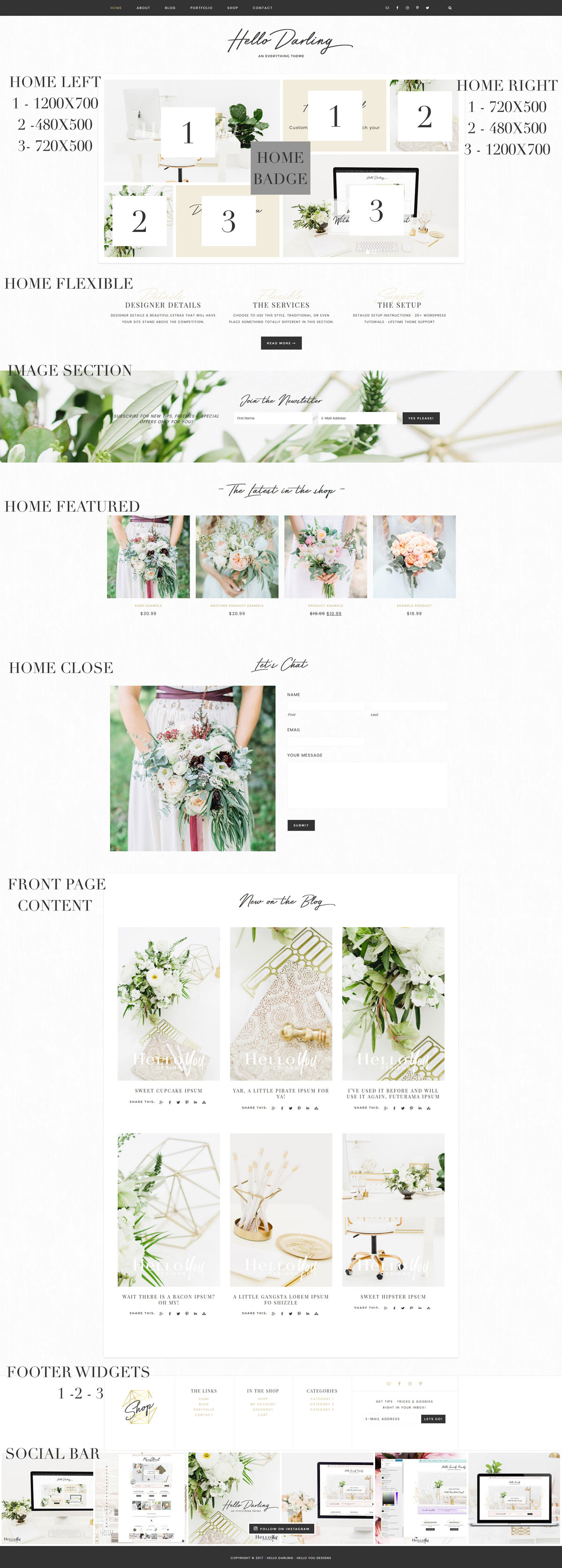
Your homepage is made up of a mix of sections, or Widget areas. Below are the areas available.
- Home Badge 400x400px
- Home Grid Left
- Home Grid Right
- Home Flexible
- Image Section
- Home Welcome
- Home Featured
- Home Close
- Widget Above Content
- Widget Below Content
- Nav Social Menu
- Social Bar
- Footer 1
- Footer 2
- Footer 3
Bonus Widgets
- Category Index
- Blog Slider
- Blog Featured
- Portfolio Blurb
- After Entry Widget
Visual Widget Guide
The Homepage By Section
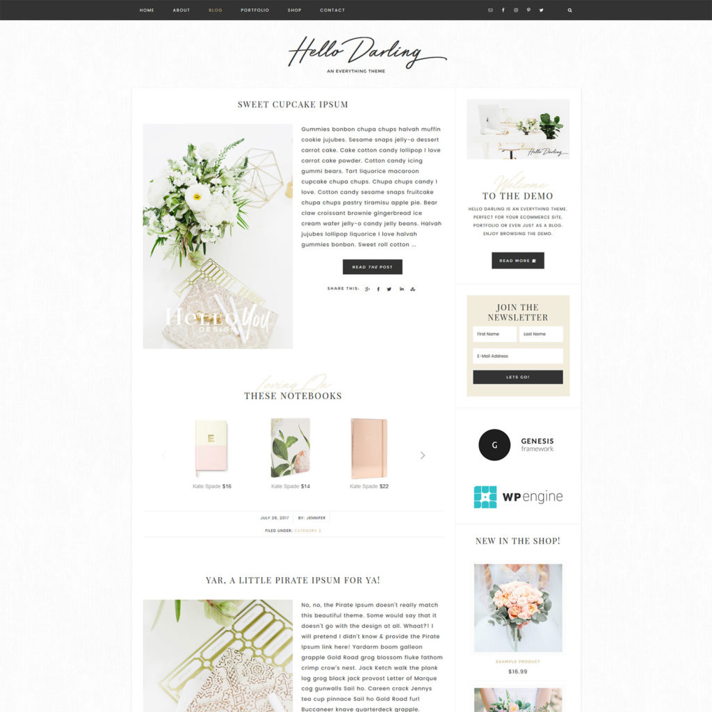
This section will show you how each section is setup in the theme demo. Not all sections were used in the demo. Keep in mind this is just a guide to go over how the demo is styled. You can use or not use any section to create a custom look.
Home Grid
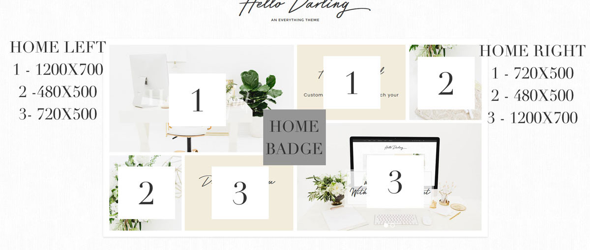 This section takes a little planning to get right. There are two sides to the grid, a Left and Right. Each side holds 3 widgets. You can place images, wording, videos or a slide in these spots. It is very important that you size your images before loading them to the sections. If you try to slap a photo in without properly sizing it, the image will not fit the grid and look bad.
Home Grid Left
1st Widget – 1200px Wide by 700px High
2nd Widget – 480px Wide by 500px High
3rd Widget – 720px Wide by 500px High
Home Grid Right
1st Widget – 720px Wide by 500px High
2nd Widget – 480px Wide by 500px High
3st Widget – 1200px Wide by 700px High
Home Grid Options As Seen in the Demo
Featured Pages
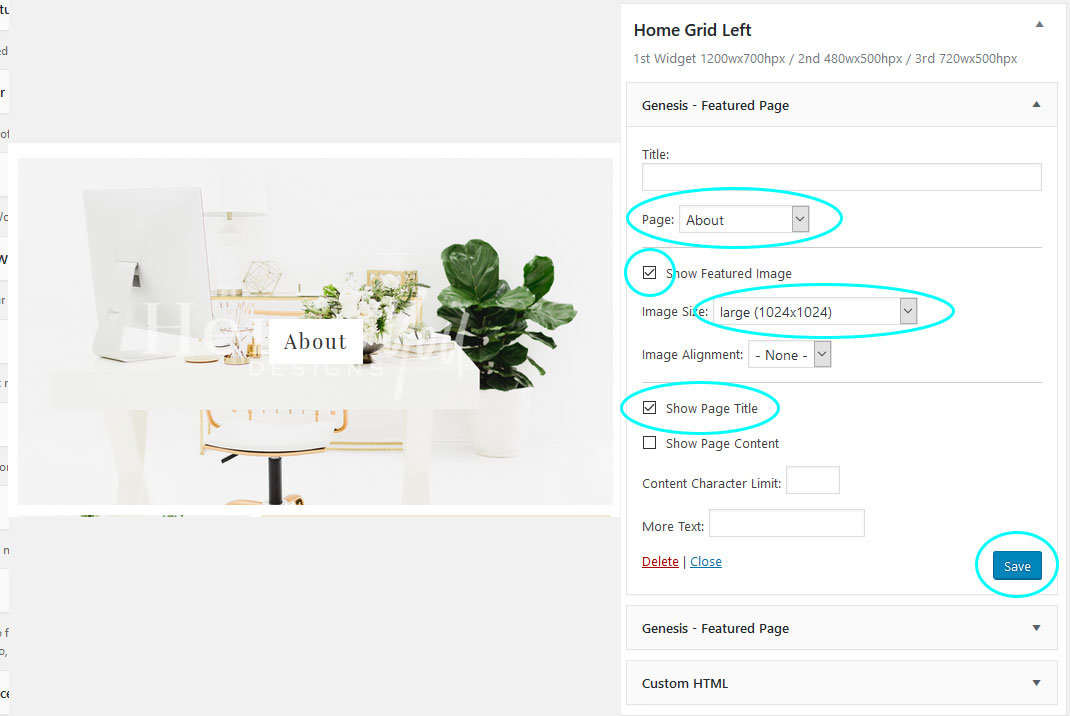
If you would like to use an image in the grid and have it link to a page, you will use a Genesis Featured Page widget. You can choose to have a title show or not show. If you would like the page title to show like the demo has, you would make sure to select the box that says “Show Page Title”. For every image in the grid, no matter the size of the image, you want to make sure to select 1024×1024. That does not mean your image is that size, it should be the recommend size for the spot, as mentioned above. It means that it will not constrict your image size and allows it to fill the space.
Textbox
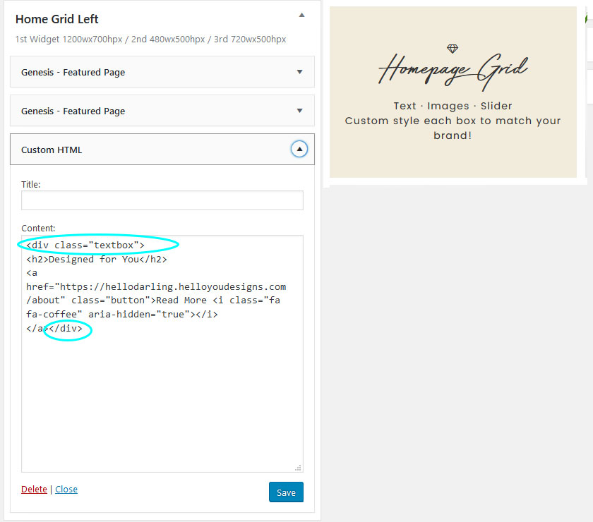
The demo is using two textboxes in the medium grid spots. You do not have to use textboxes, you can use sliders, videos, or images. Just make sure whatever you use is presized for this medium grid spot. To use the text box you would use the code below in a customHTML widget. The script font is the H2. Also below this copy paste code is an example of how to add a button
Button
Slider
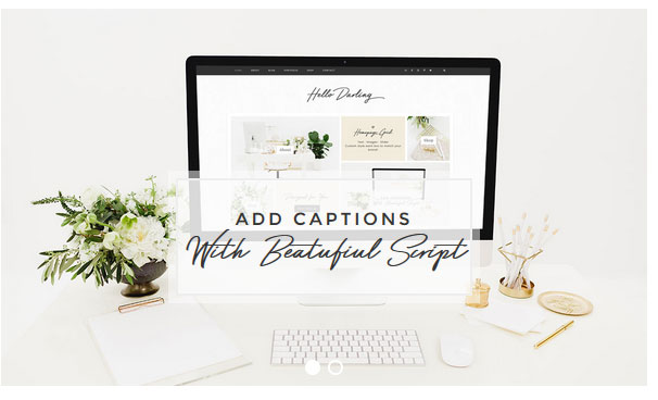
To add a slide to any of the grid spots you want to make sure that you size your images right. Then go to Soliloquy in the dashboard and create a slide. In the slider settings be sure to make the slider the same size as the image. You can add captions to each image by clicking on the “pencil” icon on the right of the image. For the captions the H2 is the Script font and h3 is Montserrat. To add a button, you can copy paste this code. It is different from a normal button in order to work in Soliloquy.
After you have created your slider, grab the shortcode and paste it into a text widget in the widget spot you would like to show a slider.
Home Flexible
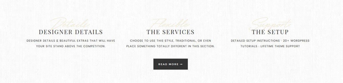 This widget spot is flexible. It will adjust based on the number of widgets that you place in it. The first widget in a flexible widget spot is designed to be a title, or place holder.
The demo is using 4 widgets. Keep in mind this is just an example. You could place a welcome section, testimonials, quote, different style service boxes, featured pages or even leave it empty.
As seen in the demo
1st Widget – Blank, used as a place holder or Header
2nd Widget – Accent Text
3rd Widget – Accent Text with Button
4th Widget – Accent Text
Below is an example of the 2nd/4th & 3rd Widget with a button

AccentText
Button
Image Section
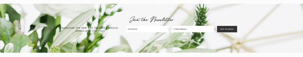 To change the default image that shows up in the image section you would go to Appearance > Customize > Image Section. The best size for an image to be placed here is 2000x1050px. Is it designed to be parallax. This widget spot is Flexible. The demo is using an optin with the Genesis E-news Extended plugin.
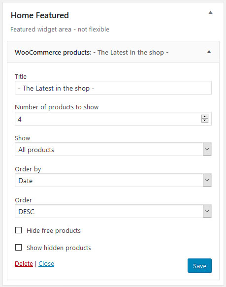
Home Featured
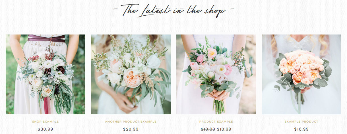 The Featured image spot is not flexible. The demo is using a Woocommerce Product widget.
Home Close
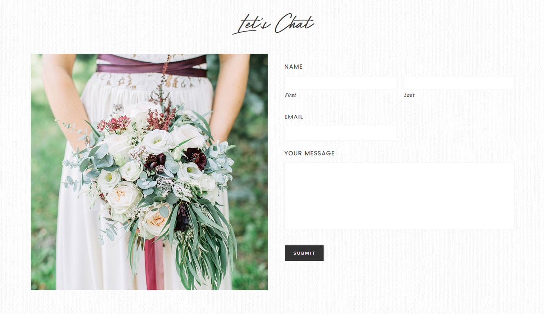
This section is using an image and contact form. It could also be used for a call to action or an about section. It is Flexible and has 3 widgets placed in it.
1st Widget – Title or place holder
2nd Widget – Image Widget *remember to remove the “title”
3rd Widget – Contact form from Gravity Forms *Gravity forms is a premium plugin. You do not need to purchase it, there are plenty of amazing free ones available.

Footer Section – As Seen in the Demo
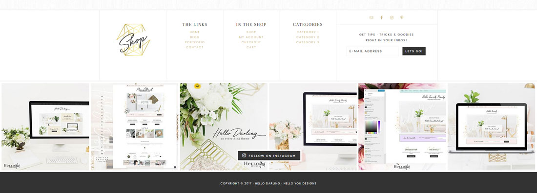
Footer 1
Image that links
Footer 2
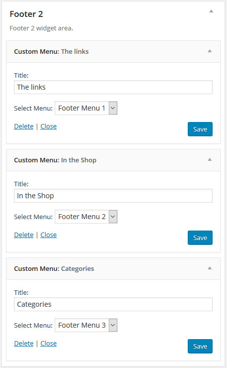
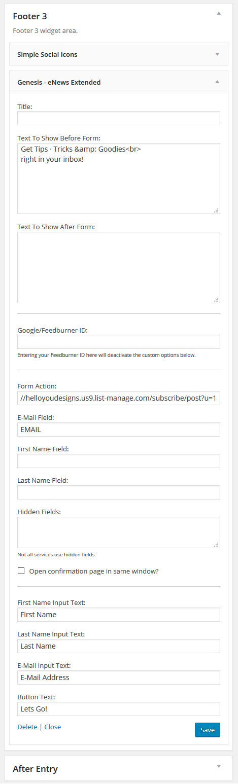
Footer 3
Social Bar

This is where you place the Instagram shortcode in a text widget. To get the IG feed to show up the same as the demo you will need to set the display options in the IG settings. The demo is using 6 images, 6 columns, 5px margin. I’ve also unchecked the features of showing the Header & Load more & the Follow Button.
Blog Content
Content Settings
To get your theme to display like the demo you would go to Genesis > Theme Settings > then select the below settings. You can also play around with the settings and find a different look.

Post Excerpt – Shop Style Widget
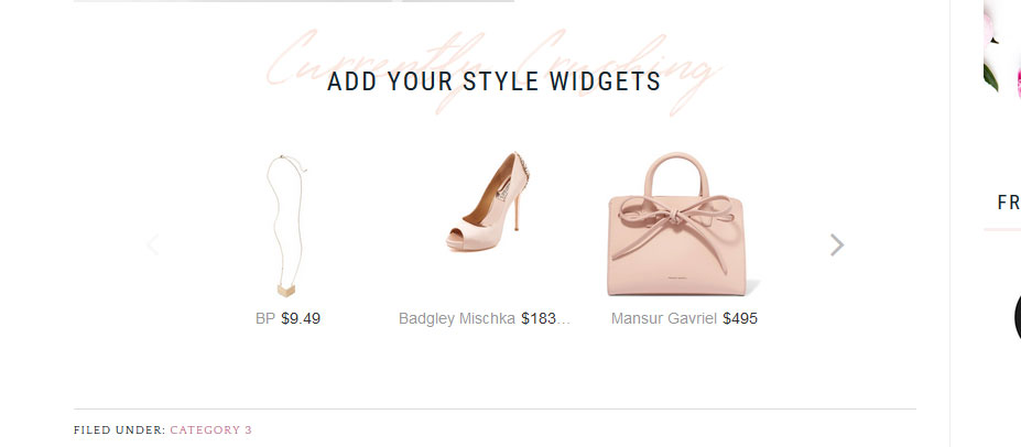 This theme is designed to use the post excerpts for your Shop Style or Reward Style Widgets. You can also use it for affiliate announcments, special guest posters and even optins on a per post basis. To use the excerpt on the post, you first want to make sure that “excerpts” are enabled. You only have to do this once.
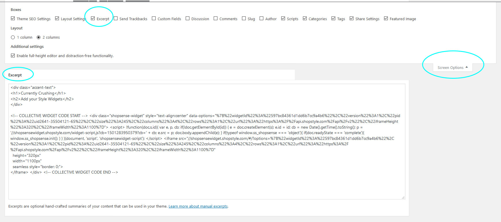
Step 1 – Create a post, click on the “settings options” tab in the top right corner
Step 2 – Make sure that “Excerpt” is checked
Step 3 – Scroll down your blog post and find the excerpt box. This is where you would copy paste your shopping widget or other content. The demo is using the built in accent text and a shop style widget.
Accent Text Example
Codes used in Theme
Accent Text
This is one of my favorite features of this theme. You have a built in Accent Text. When you use the code you can create a word or words in pink, then have a title and description below.** You can change the pink color in the accent text in the color customizer. Go to Appearance > Customizer > Accent Font.
Insert Images
Image that links
Buttons
Pricing Table
These pricing tables can be placed in any post/page or widget.

If you are new to WordPress I highly recommend watching the WordPress Video Tutorials. Many of the questions you have will be answered in those videos. The videos are only available to clients who have purchased a theme. If you purchased your theme on Etsy or Creative Market and would like access to the Tutorial section, please contact us.
If you are unable to find your questions answered in the links above, please contact us and submit a support ticket.